


Affinity diagramming 101
Demystifying UX Research Synthesis

👋 Hey, Nikki here! Welcome to this month’s ✨ free edition ✨ of the UXR for Product People Newsletter. Each week, I write actionable tips, tricks, and techniques about conducting effective and efficient user research for non-researchers.
Subscribe to get access to these posts, and every post.
For more: User Research Academy Substack | NikkiBot
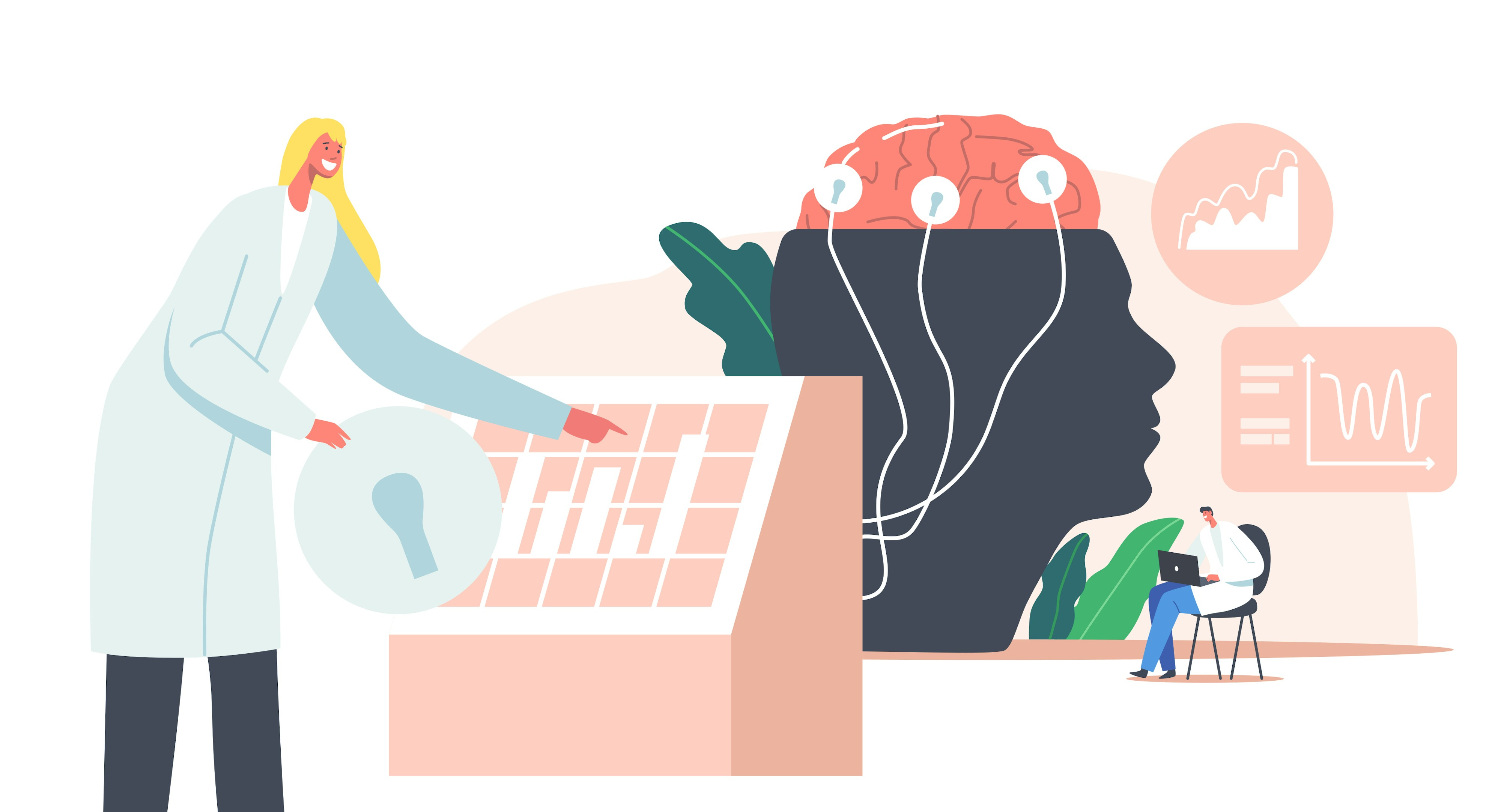
If research synthesis sounds like a mystery, you’re not alone. Affinity diagramming may sound complex, but trust me, it’s one of the most practical methods you can use to turn raw data into something you and your team can act on. By following a few structured steps, you can transform chaotic user feedback into clear patterns that drive smart product decisions.
Let’s dive into how to use affinity diagramming and tagging/coding to get there.
Why affinity diagramming
A lot of your decisions depend on knowing what your users need, but user feedback often comes in the form of disorganized quotes, varying opinions, and scattered ideas. Affinity diagramming allows you to categorize this feedback into clear, actionable patterns.
Think of it as turning a mountain of sticky notes (or digital notes) into a neatly organized map that guides your product team toward solutions. Affinity diagramming helps you break down your data, reveal patterns, and ultimately identify the top priorities for your product’s success.
But before you can start grouping ideas into categories, you need to tag and code your data effectively.
Step 1: Tagging and coding—Organizing your data
Before you can create an affinity diagram, you need to prepare your data. This is where tagging and coding come in. Tagging and coding are techniques for breaking down raw research data (like interview transcripts or survey responses) into smaller, more manageable chunks. These chunks are labeled with tags or codes that represent key themes or ideas.
Here’s how you get started with tagging and coding:
1. Review your research data:
Begin by reviewing your research data, whether it’s notes from interviews, survey responses, or observation logs. As you go through the data, look for recurring themes—these could be goals, pain points, frustrations, motivations, or tasks your users are trying to accomplish.
2. Create your tags (or codes):
Tags are short labels that describe the key ideas in your data. Here are some common types of tags you might use:
Goals: What is the user trying to achieve?
Needs: What does the user need in order to reach their goals?
Pain Points: What obstacles or challenges are they facing?
Tasks: What actions is the user taking to achieve their goals?
Motivations: Why is the user driven to achieve these goals?
For example, let’s say you’re building a fitness app, and several users mention that they want to track their workouts but find the process time-consuming. You might create tags like:
Goal: Tracking workouts
Pain Point: Time-consuming process
Motivation: Staying healthy
3. Apply the tags:
Once you’ve created your tags, apply them to your research data. Go through each interview or survey response and tag relevant sections with the appropriate codes. This step allows you to categorize your data into meaningful chunks that you can work with later.
Example:
Suppose a user says: “I really want to keep track of my workouts, but I don’t have the time to manually enter everything.”
Tag it as:
Goal: Track workouts
Pain Point: No time for manual entry
Once tagged, you’ll be able to easily search for and group similar insights across multiple participants.
4. Use both deductive and inductive coding:
Deductive coding: Start with a set of predefined tags (like the ones listed above) based on your research goals or hypotheses. This helps you categorize information more quickly.
Inductive coding: As you go through your data, you might find that new themes emerge that you hadn’t considered before. This is where inductive coding comes in—you create new tags on the fly based on what the data is telling you.
By tagging your data, you’ll be setting the foundation for affinity diagramming, making it much easier to group and organize your research later on.
Step 2: Building an affinity diagram—making sense of your tags
Now that your data is tagged and coded, it’s time to start building your affinity diagram. Affinity diagramming is all about grouping similar ideas together to reveal patterns and insights. The goal is to take the tagged data you’ve organized and visualize it in a way that helps you see connections and draw conclusions.
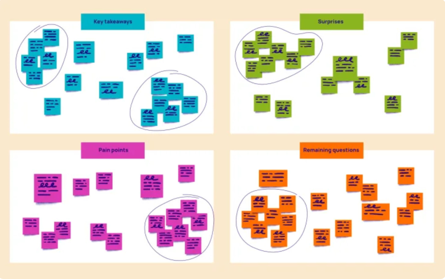
Once you’ve tagged all your research data, you’re ready to start grouping similar pieces of information. Each tag or code you’ve applied to the data represents a different insight, and now you’ll need to group those insights together based on their similarities.
Here’s what you’ll need to do:
Write down key insights: Start by writing down each key insight from your data on sticky notes (physical or digital). If you used digital tags, this might mean copying and pasting specific quotes or notes into a tool like Miro or Trello. You might have sticky notes that say:
“I need to track my workouts.”
“Tracking workouts takes too much time.”
“I get frustrated when I have to input data manually.”
Group similar insights together: Now, group similar sticky notes together. For example, all notes related to workout tracking might go into one cluster, while notes related to frustration with manual data entry could form another cluster. You might end up with two groups like this:
Cluster 1: Workout tracking
“I need to track my workouts.”
“Tracking workouts is important for my fitness goals.”
Cluster 2: Frustration with manual input
“It takes too long to input workout data.”
“The app I now use inputs workouts automatically and then I can edit what’s needed.”
Categorize your insights into four global quadrants: Affinity diagramming often works best when you categorize your insights into four broad quadrants, representing key areas of the user experience. The quadrants help you frame the conversation around the most impactful themes and turn your patterns into actionable recommendations. Here’s how you can structure your quadrants:
Goals: What are users trying to accomplish? What are their big-picture goals?
Needs: What do users need to meet those goals? What are their baseline expectations?
Pain Points: What obstacles or frustrations are preventing users from achieving their goals?
Motivations: Why do users want to achieve these goals? What’s driving them to act?
Each quadrant represents a key area that impacts the user experience. As you sort your sticky notes into these categories, you’ll start to see patterns emerge that help you understand your users on a deeper level.
Example:
For a fitness app, your quadrants might look like this:
Goals
“I am trying to work out consistently.”
“I want to see my progress over time.”
Needs/Expectations:
“The app should make it easy to log workouts.”
“I expect the app to sync with my fitness tracker.”
Pain Points:
“Logging workouts manually takes too long.”
“The app doesn’t sync properly with my tracker.”
Motivations:
“I want to stay healthy and track my fitness goals.”
“Tracking my workouts keeps me motivated to stay on track.”
Look for subpatterns within each quadrant
Once your data is grouped into the four quadrants, it’s time to dig deeper and find subpatterns. Subpatterns help you further refine your insights and make them more actionable. For example:
Goals: You might notice that many users share the same goal of tracking workouts, but some users are more focused on cardio tracking while others are focused on strength training.
Pain points: You might see that frustration with manual input is a common theme, but users have different reasons for their frustration—some struggle with the time it takes, while others find the app’s interface confusing.
By identifying subpatterns, you can make your insights even more specific, which will help you create targeted solutions for your product.
Discuss the findings with your team
Once your affinity diagram is complete, it’s time to share it with your team. Use it as a guide to discuss what you’ve learned from the research and how these insights can inform your product decisions. This is where the real magic happens—turning research data into concrete next steps that improve the user experience.
Make sure to prioritize the most critical findings and tie them to actionable product goals. For example, if users are consistently frustrated with manual data entry in your fitness app, you might prioritize building an automatic workout tracking feature.
Looking for an easy-to-use template, check out this Miro board!
Step 3: Turning affinity diagram patterns into actionable insights
Now that you’ve built your affinity diagram and identified patterns within each quadrant, the next step is to turn these patterns into actionable insights that your team can act on. The goal here is to go beyond merely identifying problems—you want to provide clear, specific recommendations that address the patterns you’ve discovered.
Here’s how you can do that:
1. Prioritize the most significant patterns
Not all patterns are equally important. Some will have a bigger impact on the user experience than others. Start by prioritizing the patterns that will have the most significant effect on your product. Ask yourself:
Which patterns are most aligned with our product’s goals?
Which patterns represent the biggest pain points for users?
Which patterns are affecting the largest number of users?
For example, if a significant number of users are struggling with a core feature like tracking workouts, that should be your top priority. On the other hand, if only a small percentage of users mention a minor issue, that can be deprioritized for now.
2. Turn Patterns Into Insights
Once you’ve identified the most important patterns, it’s time to translate them into actionable insights. These insights should clearly explain what the problem is, why it matters, and how it impacts the user experience. Here’s an example:
Pattern: Many users express frustration with manually entering workout data.
Insight: Users are struggling with the manual workout logging feature, which is slowing them down and causing frustration. This issue affects users’ ability to consistently track their progress, potentially leading to decreased engagement with the app.
By framing your insight this way, you provide context for why the issue matters, making it easier for your team to understand and act on.
3. Recommend solutions
Now that you’ve identified the key patterns and crafted actionable insights, the next step is to recommend specific solutions. These recommendations should be directly tied to the patterns and insights you’ve identified. For example:
Recommendation: To address the frustration with manual workout logging, we recommend implementing an automatic tracking feature that syncs with users’ fitness devices. This will save users time, reduce frustration, and encourage consistent use of the app.
Make sure your recommendations are concrete, actionable, and feasible within your team’s resources. The more specific you can be, the better.
4. Tie Insights to product metrics
Whenever possible, tie your insights and recommendations to specific product metrics. This makes it easier to track the success of your solutions and demonstrates the value of your research to stakeholders.
For example, if you recommend improving the workout tracking feature, tie that recommendation to metrics like user retention, engagement, or time spent in the app. This helps ensure that your insights are actionable and measurable, making it easier to track the impact of your changes over time.
5. Create an action plan
Once you have your insights and recommendations, create an action plan that outlines the next steps for your team. This plan should include:
Prioritized list of recommendations: Based on the patterns you’ve identified, which recommendations should be tackled first?
Timeline: When should each recommendation be implemented? Consider the urgency and complexity of each change.
Assigned ownership: Who on your team will be responsible for implementing each recommendation?
By creating a clear action plan, you ensure that your research doesn’t just sit on the shelf—it gets turned into real product improvements that enhance the user experience.
Step 4: Using affinity diagrams in your product workflow
One of the best things about affinity diagramming is that it’s flexible—you can use it in different stages of your product workflow, from early discovery to post-launch optimization. Here are a few ways to incorporate affinity diagramming into your regular processes:
During user research debriefs
Affinity diagrams are a great way to debrief after conducting user interviews, surveys, or usability tests. Instead of just reviewing notes and transcripts, use affinity diagramming to organize your findings and surface key patterns. This will help you turn raw data into actionable insights faster and more efficiently.
After a product launch or major feature update
After launching a new product or major feature, use affinity diagramming to analyze post-launch feedback. Group user feedback into categories like “ease of use,” “frustrations,” and “missing features” to identify areas for improvement. This will help you spot patterns that might not be immediately obvious and ensure that you’re continuously improving the user experience.
When planning product roadmaps
When you’re planning your product roadmap, use affinity diagrams to organize feedback from different sources—user research, customer support, sales, etc. Group similar feedback together to identify the most pressing user needs and pain points, and use these insights to inform your roadmap priorities.
As part of a regular sprint retrospective
Affinity diagramming can also be useful in sprint retrospectives. After a sprint, gather feedback from your team and users, and use affinity diagrams to group similar feedback together. This can help you identify patterns in what’s working well and what needs improvement, giving your team actionable takeaways for the next sprint.
Affinity diagramming is a powerful tool for synthesizing research data and turning user feedback into actionable insights. By following a structured process of tagging and coding your data, grouping similar insights together, and organizing them into the four global quadrants (Goals/Desires, Needs/Expectations, Pain Points, and Motivations), you can uncover patterns that help you make smarter product decisions.
Here’s a quick recap of the process:
Tag and code your data: Organize raw research data into key themes like goals, pain points, needs, and motivations.
Build an affinity diagram: Group similar insights together into the four global quadrants to reveal patterns in your user data.
Turn patterns Into actionable insights: Prioritize the most significant patterns, craft specific insights, and make concrete recommendations for improvement.
Tie insights to metrics and create an action plan: Ensure that your insights are tied to measurable product outcomes, and develop a clear action plan for implementing changes.
By using affinity diagramming, you can transform seemingly random user feedback into a clear roadmap for product improvements, helping you build better products that meet real user needs.
Now it’s time to put this into action! The next time you gather user feedback, try using affinity diagramming to make sense of the data. I’m confident you’ll find it a valuable tool for turning research into action. Let me know how it goes in the comments please!
📚 Additional frameworks and tactics to explore
How to synthesize data like a pro through affinity diagramming
Need Research Insights in a Flash? Try the Lightning Synthesis Method
Enjoying this? Share with others or refer a friend (and get your subscription comped!) — I always appreciate it so much!
Have a curious week,
Nikki